
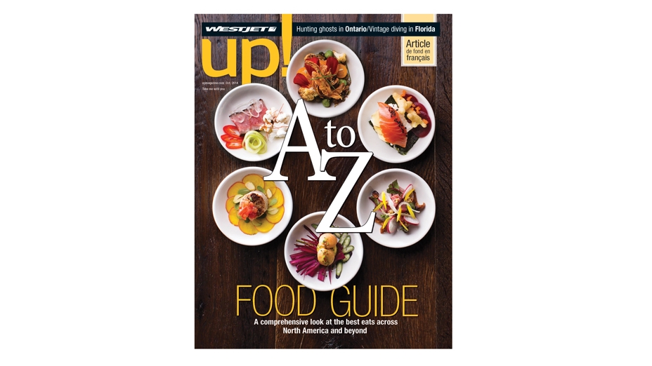
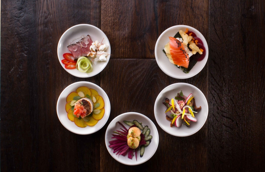
The cover of the October issue of up! magazine, WestJet’s inflight publication, looks good enough to eat. Inside, the magazine’s annual Food Guide is just as tempting. up! art director Teresa Johnston says, “Food is pretty and a pleasure to photograph. If you already have a beautiful, willing subject, why use anything else?”
The 2014 Food Guide is an alphabetical exploration of flavours and dining experiences across the WestJet universe, from A for appetizers like braised octopus in Montreal, to Z for Zihuatanejo’s open-air cooking classes. It represented an interesting challenge for Johnston, who needed both the cover and feature to convey culinary variety, reflect the international scope of the guide, and to appeal to everyone from chefs to casual diners.
Pierre Lamielle, Top Chef Canada contestant, Chopped Canada winner and long-time RedPoint collaborator, was involved with the Food Guide as a writer (of letter “H” for “Hawaii’s Best”) and illustrator. In conversation with Johnston, he suggested they make the letters out of food.
“She said ‘I don’t know how to do that,’ and I said, ‘I do!’”
Next thing he knew, Lamielle had his first food styling gig. He had two shots to set up. One was for the up! October cover—six plates representing six different food styles around the world. Here, Lamielle and Johnston composed a group of small dishes hinting at different food traditions, with dark harvest tones to suit the season.
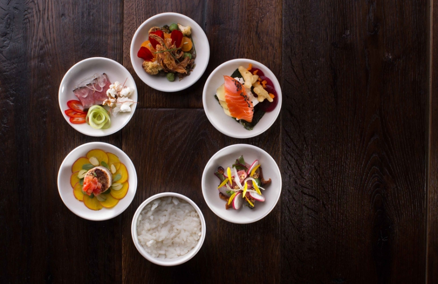
The final cover image is a composite of a few different shots, taken with different lighting and with the plates in different positions. The rice bowl in the image above was not one of Lamielle’s culinary creations, but simply a placeholder.
The second shot was for the feature spread magazine, a plated “A to Z” made out of food. “I decided it should be a meal progression as well, with A as the appetizer and Z as a dessert.”
Lamielle created all the components at home, using different shapes and coming up with a few versions so the team would have backup ideas. “I had a general plan going in, and we did a little bit of tweaking and something very different emerged.”
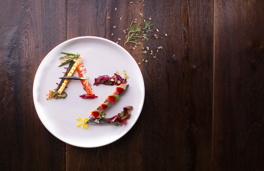
Johnston and Lamielle experimented with a few different ideas, such as this single-plate execution. Lamielle designed the letters to resemble conventional characters that appear in the feature set in Minion Pro. Lamielle added serifs to his letters using a range of foods from grainy mustard to berries and edible flowers.
Johnston says the final photograph needed to serve both cuisine and design. “My main goal was that it be legible, that each letter read as a letter. Pierre wanted the food to make sense to people who are really interested in cooking and dining. He didn’t want to just make letters out of edible things—he wanted it to make sense to other chefs as a dish.”
Although he focused on letters A and Z for the project, Lamielle says his favourite letter is M. “The more of them you put together, the more delicious it is.”
Read the A to Z Guide to Good Taste and many more inspiring tales from across the WestJet universe in up! October 2014.